Driving Starbucks’ Conversion with Motion
My Role
Concept, Illustration, and motion
This project was developed as a pitch concept to demonstrate how motion design could drive conversion in the Starbucks app. Outcomes were not measurable as the work was not commissioned.
Starbucks has always prioritized customer experience, as evidenced by the warm greeting and the writing on the cup, but its mobile app felt static and purely transactional. By introducing motion, I infused the mobile experience with the brand’s personality. Using the order-to-purchase flow, I designed motion cues that guide attention, reduce friction, and encourage each step toward purchase.
Animating loyalty touchpoints, such as the stars that coincide with rewards program milestones, or an in-app discount offer, transforms routine actions into moments of reward and reassurance. Over time, these moments of surprise and delight make app interactions enjoyable, deepening loyalty and driving conversion.
Opportunity
There is an opportunity to build out a consistent design and motion language for the digital experience.
Starbucks Motion Audit
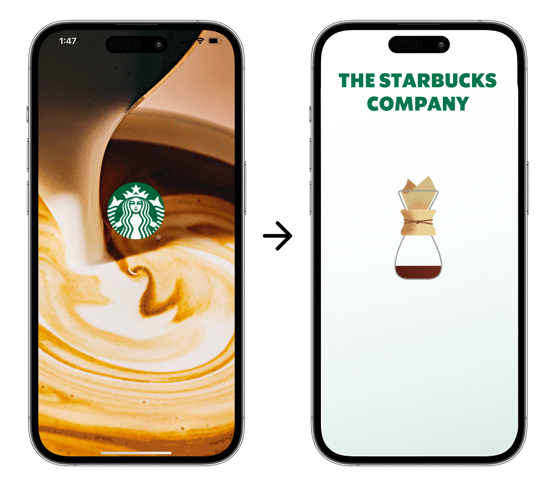
Loading Screen
The loading screen features a pour-over sequence as a metaphor for the company’s dedication to deliberate, hands-on craftsmanship and the art of coffee making.
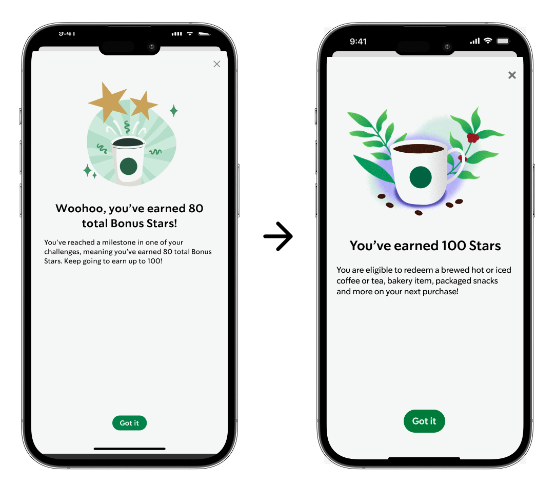
Reward Announcement Screen
The 100-Star reward animation was designed to spotlight the experience of earning and enjoying a handcrafted beverage. By framing the scene with coffee plants and beans, the design ties the reward back to the company’s roots in high-quality coffee and intentional craftsmanship.
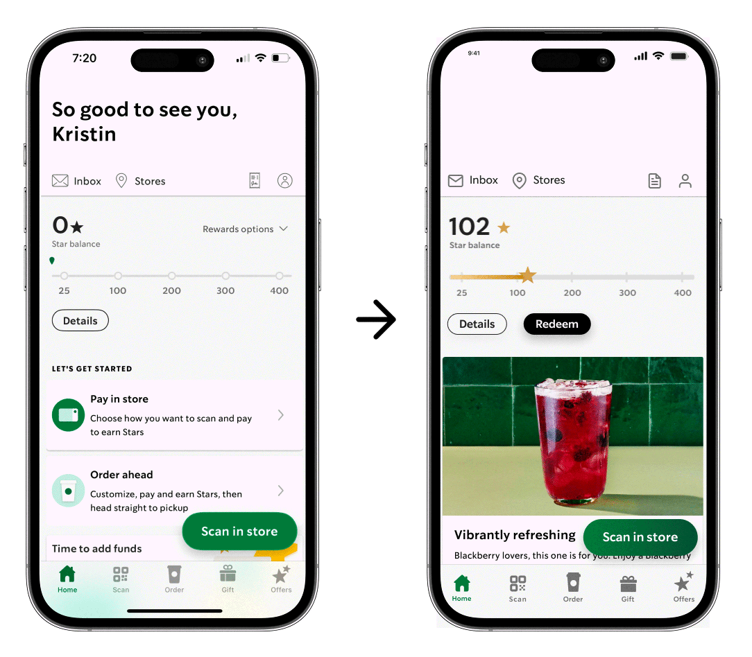
Home Screen
The home screen opens with a handwritten-style greeting, designed to evoke the warmth and personal touch of a note from a barista. This small detail brings the brand’s in-store experience into the digital space, creating an immediate sense of familiarity and connection. I also added a moving gradient to the purchase-related buttons in the Figma file to attract users’ attention.
Custom Order Screen
I wanted users to see their order come to life as they customized it. To achieve this, I replaced the full-screen overlay with a dynamic slide-up panel that updates the product image in real time, creating a more intuitive and visually connected experience.
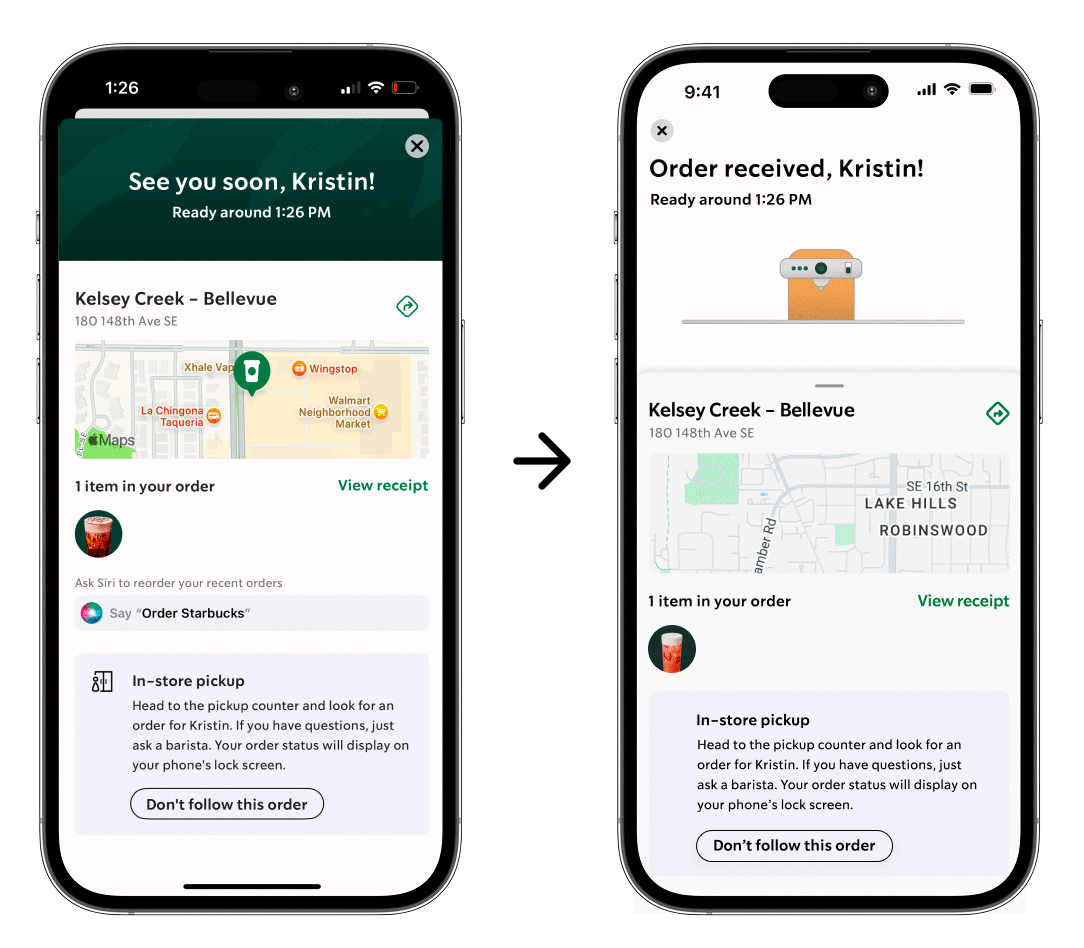
Confirmation Screen
I designed an animation to visually communicate where an order is within the preparation process. For the case study, the sequence plays at an accelerated pace, but in the actual experience, the cup moves to the espresso machine once the barista takes the ticket and remains there until the drink is marked ready.
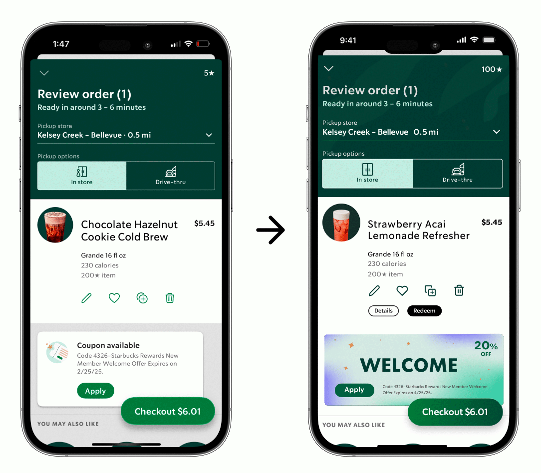
Review Order Screen
I added animation and visual emphasis to the coupon area to capture attention and guide users toward active promotions, transforming a static element into an engaging moment in the experience.
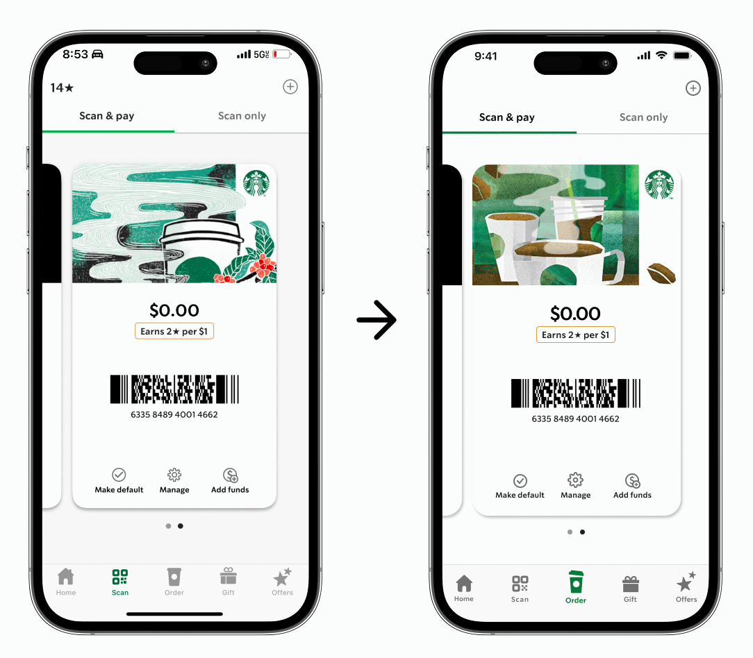
Pay Screen
I introduced subtle steam animation on the point-of-sale screen to infuse warmth and motion into the checkout experience, transforming a routine transaction into a brief, rewarding moment that reflects the brand’s spirit of hospitality.