Trupanion Icons
Trupanion set out to create a unified icon system that reflected their refreshed brand and could be used consistently across all channels. I worked to modernize and simplify the existing set, updating the palette to the new TruBlue and Canary Green. The goal was clarity and accessibility: simple, high-contrast icons that were WCAG-compliant yet expressive enough to communicate meaning at a glance.
Testing
Once the core set was complete, I animated the icons for use in web and video applications. We ran an A/B test comparing static and animated versions on the website, and the static icons ultimately drove more engagement. The insight was clear: motion should serve a purpose, guiding users or clarifying information, not exist solely for decoration. Even so, the animated set became a valuable modular library for use across Trupanion’s social and video content, extending the brand’s visual flexibility.
Previous Icon Set
Updated Icon Set
Animated Icons
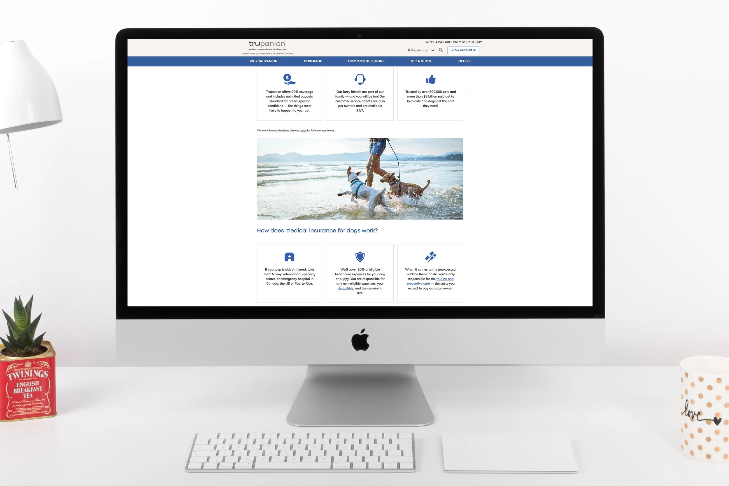
Icons on the Website